A fresh angle on space industry typography
After decades of NASA Worm imitations, is a new generation of space industry typography finally here?
July 16, 2024
It’s fair to say that Danne & Blackburn’s iconic NASA “Worm” logo has been a typographic muse for the space sector since its introduction in 1975.
Revived in 2020 by popular demand, The Worm remains a testament to the ‘uniqueness’ and ‘contemporary character’ intended by its designer, Richard Danne.
But The Worm’s cult status has left an unexpected legacy for the wider space industry.
It’s inadvertently become a reference point for emerging space brands looking to design their own logotypes, eager to tap into the resonance The Worm commands.
The result. A myriad of NASA-inspired logos.

This trend, while a testament to the immense power of the original design, has contributed to a marked uniformity in space industry typography.
Recently however, a select few are taking a different approach – one that neglects the familiar curves and single-width letterforms of The Worm, switching them for oblique angles and shifting geometry.
Interestingly this new generation of industry typography starts, once again, with NASA.
Back in 2019, NASA’s JPL hired London-based agency Accept & Proceed to design a typeface for their GRACE-FO (Gravity Recovery and Climate Experiment – Follow On) mission. They developed the angular Grace-FO Display typeface, inspired by the trapezoid shapes of the mission’s twin satellites.


The construction principles of the letterforms see rectangular shapes used as counters while oblique angles define the outline of each letter — rectangles inside and oblique angles outside.
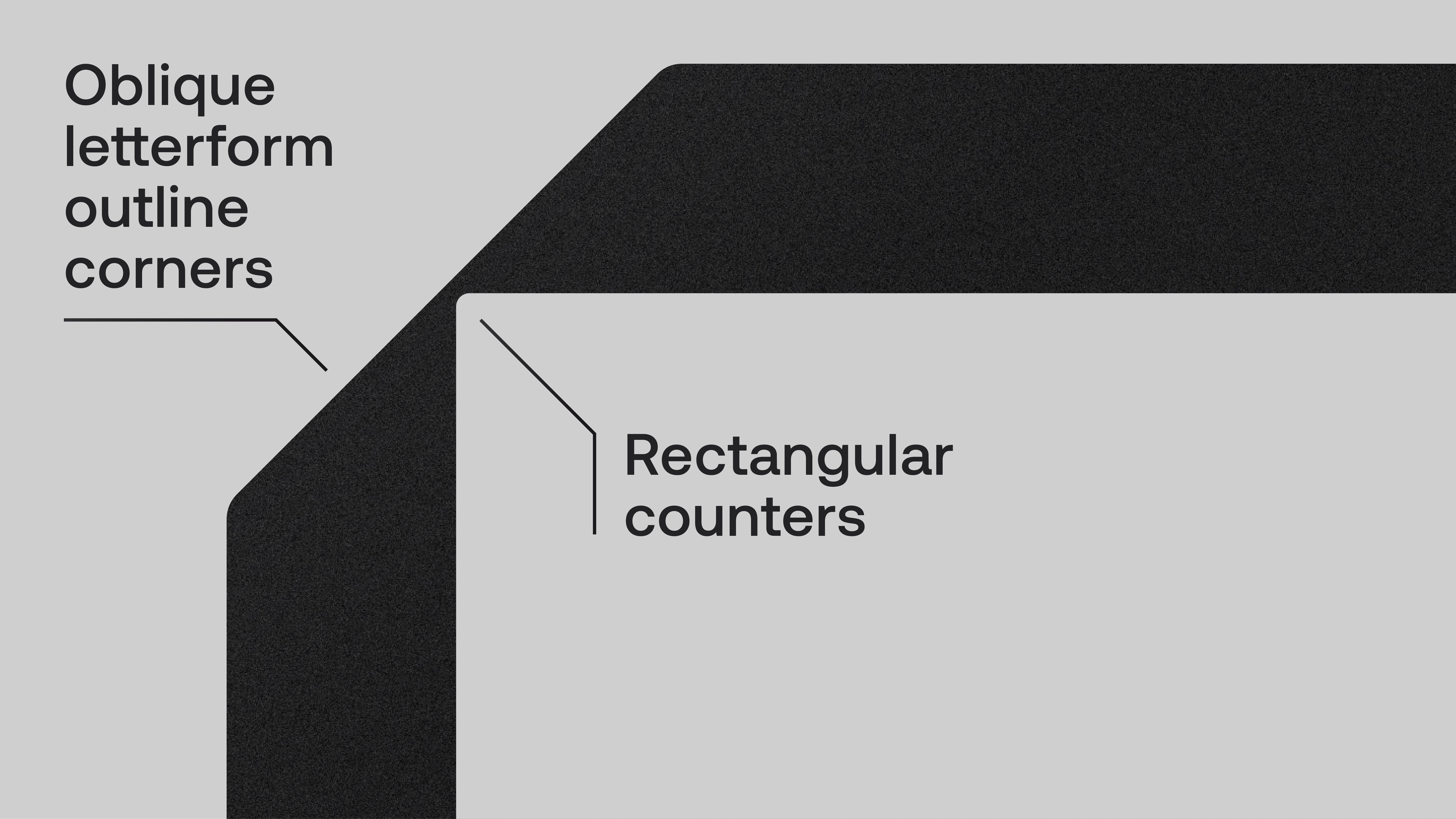
The result is a typeface every bit as fluid and digital as the GRACE-FO data it was designed to represent.
Fast forward to today and similar typographic styles are beginning to appear elsewhere.
Take the logo of EO insights project Clay, which explores similar letterforms, using Lundqvist & Dallyn’s Proxy-Mono typeface.
And more recently still, hyperspectral intelligence company Kuva Space embraces a simplified, extended iteration of the style in its newly updated logo.
While we can’t point to these examples as a full-blown design trend, they do offer a glimmer of something new, a welcome shift from the sea of sameness left in The Worm’s wake.
In the face of emerging typographic styles, like this one, there’s always temptation to imitate rather than evolve.
But, the real opportunity for space industry marketers, designers and strategists is to harness emerging styles not as templates, but as inspiration. To unlock different ways of seeing themselves and to give the space industry the new angles it deserves.